Contemporary Nomad - Some Thoughts on Museums After Reading Tomislav Šola
Few days
ago I was reading an article in Artguide, an extract from a book about 25 deadly
sins of contemporary museums by Tomislav Šola(which trace I failed to find
on Amazon or any online/offline retailer). This article summed up my own concerns and
thoughts about how many museum fail to make the exhibitions interesting and even
visitor-friendly. For Croatian Šola and his colleagues
visitor-friendliness includes interaction and ability to learn, comfortable chairs, readable and legible signage,
no queues in the toilets, ability to get a cup of coffee, etc. - all those indispensable characteristics of a good modern museum.
What about the atmosphere itself? It’s de-facto that
a visitor is welcomed to a museum as he/she agrees to spend both the time and
the money there. Museums compete for sponsors' money, visitors' attention and positive feedback in social media, all interlinked and important. But this basic and incontestable free market economy's rule of making your client/customer happy is non-existent
in most of ex-Soviet countries' state museums, even those that are considered the titans and elite in museum world, relatively progressive and open-minded, time to time show hostile attitude to a visitor. A centuries-long "Who is to Blame?" question posed by a Russian writer Hertzen can be also asked in this matter, but it is a type of question that cannot be answered in one sentence, yet the attempt to answer it will drive me away from the main purpose of the post.
When I step in a state-owned museum, be it in Russia, Azerbaijan or Kazakhstan, I feel
very unwelcome as if I disturbed someone at 2AM with my call or unexpected visit. There are, of course some exceptions, those who truly enjoy their work and for whom low salaries or other challenges/problems do not leave a mark on their face and overall mood, but usually museum employees seem
to be always irritated and speak through set teeth or stare at you with
suspicion while you move from one item to another controlling that no photos
are taken or a cellphone is picked to answer a call. To me it was twofold surprising to experience this
kind of strict control over phones and cameras usage in The History of Soviet
Pavilions, Part Iexhibition curated by Marina Loshak who in her interview to Russian TV along with discussing her vision of being
a newly appointed director of State Pushkin Museum of Fine Arts in Moscow highlighted
the fact that she is against controlling visitors or prohibiting them to take
pictures as this is a way of interaction and learning.
Unfortunately, Manez has no English language website -
a shame to one of the best Moscow's contemporary exhibition spaces
Prohibiting taking no-flash pictures, in my opinion, is inappropriate and badly managed anyway. This tendency did not come by private art centers. In artist-owned Gapchinska gallery in Kiev I was explained that this is artist’s will and a way to
fight copycats. In private Pinchuk Art Center before I made a disappointed face the guide had told me that I could find high quality pictures of all pieces from ChinaChina exhibition online, so I was happy at the end. Still, I believe that whoever wants and needs to take a picture will definitely leave the place with a bunch of photos or find them online elsewhere. On this occasion, I have an unforgettable story of a challenge when in
a group of three we spent around 10-15 minutes to distract attention of Turin's Castello
di Rivara's attendants so that our friend takes a photo of
Maurizio Cattelan’s Novecento piece (a taxidermied horse hanging from the ceiling) that I actually now found on artist's website! Probably, the level of excitement, fun and childish mischief we all shared can be only knocked off by Godard's scene of running through Louvre.
Maurizio Cattelan,Novecento, 1997. Photo by Paolo Pellion di Persano. Courtesy of the artist
Even with no photo policy, Pinchuk's center holds the garland of victory in my list of contemporary art experiences in five ex-Soviet countries I have been so far, maybe since it is private, organized by a passionate art collector who invests a lot to develop new activities managed by a foreigner. Going to state museums unless it's Hermitage or anything as significant and target international visitors, is usually depressing. The Night of Museum in Almaty made me regret of leaving my hotel room as all expositions were closed, the biggest attraction was taking a photo with parrots and sleepy owls at the entrance, inside there was a fair of badly made crafts displayed in self-made booths and creepy things like a book titled "Life Through The Prism of Death" that I even was afraid to open... Maybe it is wrong to generalize the entire country's museums based on the visit to the Central State Museum, the biggest in whole Central Asia, but the photo of the hall below speaks for itself.
On the photo: people dancing under weird music mixed with Yuri Gagarin's historical April 12, 1961 speech.
In all CIS countries I've been so far, private art centers are more innovative and dynamic, yet relationship management and communication ethics is uneven: I left Moscow's Winzavod with mixed feelings as I really enjoyed the site, but not that much restaurant service or my conversations with some of the galleries employees finding them extremely rude or arrogant (or both) once they have cleared that I am not intending to buy anything on the spot. Owned by Dasha Zhukova, Garage Center for Contemporary Culture (GCCC) in Moscow had expensive tickets, but well-curated events. Plus, it was the first time an employee, a young female, smiled and wished me a nice day when issuing the ticket! However, I did not get why in such a small perimeter there were so many employees, ca. fifty vs. at most twenty five-thirty visitors. In addition to young attendants dispersed few meters away from one another and thus outnumbering the visitors in the exhibition space, there were few London-club bouncer-like males dressed in Men in Black style suits walking in the park. These professional bodyguards' mission remained unclear to me as neither Dasha nor her rich husband were anywhere close, the artists on display were famous, but not contemporary art superstars like Gerhard Richter or Jeff Koons, so I felt very sorry about these emotion-free guys looking so odd around children's playground and hipster-favorite outdoor resting zone. Ah, and of course, cameras in each corner complemented the feeling of Big Brother silently watching every step one takes.
I didn't have guts to take a picture of Men in Black bouncers, so instead enjoy the
picture of Garage's ad - a friendly invitation to be in the center of contemporary culture
Despite all of above pitfalls, it will be wrong not to mention that both state-owned Manez and Winzavod/Garage CCC exhibitions were exceptionally interesting and enriching and sooner or later I finally finish editing my posts from this summer. Also, Šola would be probably happy to discover that Garage's restaurant offered a very nice menu, had a summer terrace and restaurant's employees were friendly enough to let me leave my laptop charging while I walk around the exhibitions with a phrase "sure, we will keep an eye on it, but no one will steal it anyway" (a double-meaning phrase that either sheds some light why they would need those bouncers-like security in the garden or just an acknowledgment that my ugly Lenovo work laptop was not sexy enough to be stolen in Moscow's center for contemporary culture).
Sometimes we walk in a museum or exhibition space and have a déjà vu feeling. When it comes to Picasso and Braque, I struggle sometimes to identify who painted what since these two guys for a few years had what I call "artistic twinship". If you want to have some fun, try to name or guess who painted what and you can later check the answers at the end of this post. Actually, while searching for the images online, I have noticed that Braque paintings are usually more yellowish while Picasso's - grayish, also Picasso's works from that period are more clustered with geometric shapes or color ranges, but I might be wrong.
1.2.
3.
4.
5.
6. 7.
8.
9.
10.
11.
12.
13.
14.
15.
Before you scroll down to check the answers, one more question: Do you think that these two paintings are made by Paul Cezanne? Well, one yes.
16.
17.
While development of cubism is attributed to Picasso and Braque, it was Paul Cezanne who first described the nature as "<...> in terms of the cylinder, the sphere, the cone; put everything in perspective, so that each side of an object, of a plane, recedes toward a central point" (1904).
Discovering Italian futurist Gino Severini's painting from his Parisian period, has aroused a question that I should still investigate and probably write a separate post: why guitar is so often a subject of a cubism painting?
Gino Severini, 1919, Nature morte à la guitare
These two paintings to me fall into artistic twinship, despite Google ImageSearch disagreement (click here and here).
Umberto Boccioni, Dimensional shapes of a horse, 1913
Robert Delaunay, Simultaneous Windows on the City, 1912
Pop-art start Roy Lichtenstein has made series of pop interpretations of famous paintings including those of Picasso, Van Gogh, Matisse and Carra.
Roy Lichtenstein, Vincent's Room, 1992
Vincent Van Gogh,Vincent's Room, Arles 1888
Roy Lichtenstein, The Red Horseman, 1974
Carlo Carra, Red Horseman, 1913
Copying famous artists is not new. If you happen to be in Madrid's Prado search for Adam and Eve painting and when you discover the two in the same room, you can play a game "find some differences". I've counted five, no, six.
The latter also reminds a bit of Tim Hawkinson's Fruit, 2004 from Body Parts post.
Of my recent online random discoveries of "artistic twinships", I can name Giuseppe Mastromatteo's Indepensense 2009 series that I first saw the same year during MiArt show in Milan and Diana Chyrzyńska's Face Self-Portrait.
Giuseppe Mastromatteo
Diana Chyrzyńska
From first sight, the two photos below might look like belonging to the same artist, yet young Seattle-based photographer Austin Tott (Concept pictures) and Jasper James (City Silhouettes) who currently lives in Beijing probably never met as well as aware of their art similarity.
Austin Tott
Jasper James
Look at these double exposure portraits by Dan Mountford, a young designer from Brighton,Aneta Ivanova who merges portraits with cities in Germany, Christoffer Relander from Finland and Francisco Provedo from Argentina both preferring nature, and animated double exposure photos by Daniel Barreto.
Dan Mountford, Early 2010-Late 2011
Aneta Ivanova
Cristoffer Relander
Francisco Provedo
Daniel Barreto
Do you prefer sad trees by Kristina Gentvainyte...
..or less gloomy version of Traci Griffin?
I will have to repeat the question: do you like photos by Alexander James from his Glass series...
...or Tim Walker's exotic rose desert he shoot for Italian Vogue?
M.C. Escher's 1946 Eye Color drawing was probably inspired by Rene Magritte's 1928 The False Mirror that reminds me a traditional Middle Eastern bad eye amulet...or maybe vice verse?
Bertrand Lavier - Compositions noir et rouge, 2011
Alexander Calder, 'S-Shaped Divine', 1946
Takato Yamamoto and Alfons Mucha might not be identical in their style, but Czech artist was probably an inspiration for Takato.
Takato Yamamoto
Alfons Mucha, calendar
Another pair, different media, but very similar result: cut colored paper of Jen Stark vs. cut and then painted wood by Jason Middlebrook
Jen Stark, Sunking Sediment
Jen Stark, Vortextural
Jason Middlebrook, Finding Square 2011
Jason Middlebrook, Finding Square 2011, detail
Jason Middlebrook, Vertical Landscape Painting
While Satoshi Hiroshi creates cosmic landscapes out of various small objects like beans, stones, pearls and chocolate, Palestinian-Lebanese artist Mona Hatoum used less aesthetic material - cut human nails, which still did not undermine the beauty of the piece: entrapped in the raisin nails remind me letters from Arabic alphabet.
Satoshi Hiroshi - Beans Cosmos, 2013
Mona Hatoum, One Tear, 2007, Human nails and polyester resin
More sculptures... I admit, there is a less obvious connection, still I find these three artists are very similar in their style, so if I looked at these pieces without knowing who did what to me they would seem an artistic creation of the same person.
Rafael Barrios, NIMBUS ASCENDENTE, 2013 - Opalescent Magenta, Hand Made Lacquered Steel, 150.00 X 56.00 X 10.00 cm. Source: ArtSawa
George Charman, The Way Bacl, ceramic sculpture.Source: Saatchi Online
Probably inspired by Magritte's Castle in the Pyrenees 1959 oil painting, few artists have made their versions of levitating castles. Out of the four artists, the two are using digitally modified images to create the effect of levitation (Yang Yongliang andGiuseppe Lo Schiavo), but Ahmet Ogut went further by building an installation of a balloon floating above Ghent. Polish artist Agnieszka Kurant's piece of getting some aid from science and nature to reach real levitation effect is my favorite.
The Silent City - Digitally Assembled Futuristic Megalopolises by Yang Yongliang
Giuseppe Lo Schiavo
Ahmet Ogut
Let's Make Plastic Fantastic
In the group of plastic loversElena Saenko, Naomi White and recently discovered Edi Go are the ones I know so far working in converting usual plastic bags we so often use and waste in our lives into refined art objects. My comment is off-topic, but in Soviet Union plastic bags were a capitalistic rarity, so people would wash and reuse them!
Elena Saenko's Rustling Series
Naomi White's Plastic Currents
Edi Go's Elastic
Hats are boring!
Dutch artist Heldrik Kerstens likes to experiment with "daily objects" converting them into medieval head wear. A noble and calm gaze of a model, supposedly his daughter, completes the experiment. Sebastian Schramm's head wraps are a bit messy probably also representing the thoughts of our generation.
Some go further preferring octopuses on their heads like on Monica Cook's hyperrealistic painting and Sarah Ann Loreth'sphotography.
Monica Cook
Sarah Ann Loreth
Hungry?
Henry Hargreaves
Hedi Xandt
Giuseppe Archimboldo
Henry Hargreaves, Mark Rice-Ko
Mark Rothko
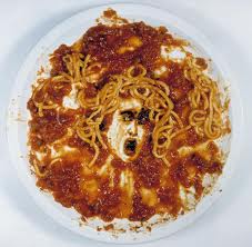
Vik Muniz
Michelangelo Caravaggio, Medusa
While artists as small kids experimenting with their food on the plates (Vik Muniz with his spagetti in particular), Caitlin Freeman, pastry chef of Miette bakery and Blue Bottle Coffee from San Francisco, saw the opportunity from another angle: making her desserts inspired by famous paintings and sculptures. The whole collection is now in a book published this year.
Mondrian Cake made of vanilla and red velvet cake with chocolate ganache (right) inspired by Composition in Red, Blue, and Yellow” by Piet Mondrian (1930).
Image Source: trendland.com
And something that I've experienced myself in Amsterdam's Bridges restaurant - the dessert version of these three little creatures from the painting in the restaurant's hall.
photos were taken in April 2013
(Flying) Carpets Revisited
"Wait a minute, I have seen that before!" popped up in my mind when I saw Babak Golkar's Need to Communicate, 2010on Dubai-based gallery's website. Indeed, it reminded me Faiq Ahmed's work dated three years earlier.
Babak Golkar, Need to Communicate, 2010, Persian carpet, acrylic paint, 61 x 61 cm
Faiq Ahmed, Flood of Yellow Weight, 150 X 100 cm, Woolen handmade carpet, 2007
Déjà-vu happened again when writing a post Oriental Carpets Revisitedon contemporary carpets and art inspired by oriental rugs, I have discovered how similar are the works of the two homonym artists, David Thomas Smith and David Hanauer: aerial view ofUS cities views and landscapes obtained through Google maps were mirrored to replicate the pattern of Persian carpets with the only difference that Smith kept his Photoshop images as C-prints while Hanauer put them on carpets.
"Based on the generated vocabulary of forms, while also modifying the template, David Hanauer ties on the traditional ways of figurative story telling with the carpet being the image carrier. „Worldwide Carpets“ are not only everyday objects: they do as well report about the contemporary human being who is using the carpet."
David Hanauer, WorldWide Carpets series, 140 x 190 cm, photograph printed on carpet material. Single carpet. Source: castelhill.com
"The term Anthropocene suggests that the Earth is now moving out of its current geological epoch, called the Holocene and that human activity is largely responsible for this exit from the Holocene, that is, that humankind has become a global geological force in its own right."
Paul Crutzen
"Composited from thousands of digital files drawn from aerial views taken from internet satellite images, this work reflects upon the complex structures that make up the centres of global capitalism, transforming the aerial landscapes of sites associated with industries such as oil, precious metals, consumer culture information and excess. Thousands of seemingly insignificant coded pieces of information are sown together like knots in a rug to reveal a grander spectacle."
David Thomas Smith
David Thomas Smith, Anthropocene series, Las Vegas, Nevada, USA, 2010-2011. Source: The Copper House Gallery
David Thomas Smith, Anthropocene series, Biosphere 2, Oracle Arizona, USA, 2010-2011. Source: The Copper House Gallery
David Thomas Smith, Anthropocene series, Three Gorges Dam, Sandouping, Yiling, Hubei, People's Republic of China, 2010-2011. Source: The Copper House Gallery
The other two pieces below I would call "same, same, but still different", I hope, you get what I mean.
There is also a Dutch group called We Make Carpets that make carpets and they came into my mind when I saw a photo by Sanan Aleskerov in the Ornamentation catalog of Azerbaijan pavilion for Biennale 2013 in Venice.
Sanan Aleskerov, Carpet, 2003, materials: different fruits, 100x400 cm
We Make Carpets, Candybar Carpet (made out of Twix and Bounty chocolates), commissioned by Slokdarm festival, Veghel, The Netherlands.
For some reason, Farid Rasulov, Carpet Interior digital print series remind a Novotel commercial and I find Robert Heinecken's installation from Sensing the Technologic Banzai at Cherry and Martin gallery quite similar to what Farid came up with.
Farid Rasulov, Carpet Interior, digital print on aluminium, plastification, 150 X 100 sm
Novotel 2007 commercial
Robert Heinecken's installation from Sensing the Technologic Banzai at Cherry and Martin gallery. Image Source: Contemporary Daily
Same, same, but different II
Before Mark Rothko and Barnett Newman started experiments in Color Field technique, Russian avant-garde artist Olga Rozanova's pieces anticipated the evolvement of abstract art by more than two decades.
Olga Rozanova, Abstract composition, 1917
Mark Rothko, No.5/No.22, 1949
Olga Rozanova, Green stripe, 1917
Barnett Newman, Onement, I, 1948
Same, same, but different III
Gerhard Richter, Tante Marianne, 1965 painting
Andy Denzler, Nico (after Warhol Screen Tests), 2006, Oil on canvas, 80 x 100 cm
Ryan De La Hoz, Maiden No. 2, 2013, 24 x 36, Hand manipulated archival print, laser-cut acrylic sheet. Source: artist's website
When visiting Budapest's Kuntshalle I have found works Judit Rita Raboczky very much resembling to the variation ofPawel Althamer's 2011 commission for Deutsche Guggenheim, Venetians large-scale sculpture installation for 2013 Venice Biennial while the installation of Szanyi Borbàla - to another Polish artist NeSpoonwhose works are based on lace patterns usually inserted into urban landscapes.
Judit Rita Raboczky, Looking in the Mirror, 2011, achor
Judit Rita Raboczky, Looking in the Mirror, 2011, achor. Detail
Judit Rita Raboczky, 2011, achor
Pawel Althamer at Venice 2013 Biennale with a variation of his 2011 commission for Deutsche Guggenheim, Venetians large-scale sculpture installation
Szanyi Borbàla, YSA PUR III, 2013, iron
NeSpoon, Franciacorta project for Art Kitchen Foundation. Source: artist's Behance page
Make Love, Not War!
The two photographers, Claire Felicie with Marked snapping photos of Royal Netherlands Marine Corps between 2009 and 2010 before, during and after their military service and Lalage Snowexecuting the same project but involving UK soldiers in Kabul, Afghanistan and calledWe Are The Not Dead back in 2012, through these triptychs research the impact of the war on individual person.
"The photography is pretty simple so it is what the viewer chooses to read or see. This project was about making the Afghan war personal, I guess, and not just about numbers."
Czech artist David Cerny's Saddam Hussein 2005 image in formaldehyde, direct parody of Damien Hurst's The Physical Impossibility of Death in the Mind of Someone Living, was banned few times due to its controversial subject-matter.
Another provocative parody by David Cerny is quite recent: it was installed on October 21st, 2013 on Prague's Vltav River facing Prague Castle, president Milos Zeman's residence, as a response to early general elections of this Friday that might bring The Communist party back in power after 1989.
The concept reminds Maurizio Cattelan's sculpture frozen in fascist greeting with all but one finger cut off that was installed in 2011 at Piazza degli Affari of Milan in front of Palazzo Mezzanotte (built in 1932 during fascism era and now home of Borsa Italiana) with the dubious title L.O.V.E. The author himself explains it as acronyms for libertà, odio, vendetta, eternità (liberty, hatred, revenge and eternity). Quite different from Robert Indiana's Love!
Maurizio Catellan, Love
When it comes to sculpture, these two artists have the same approach of "vandalizing" classical art:
Chad Wys
Chad Wys
Nick van Woert
When having the idea of this post two months ago, I though to be original, but actually, there is a whole tumblr blog Who Wore It Better that makes "an ongoing visual research project presenting associations and common practices in contemporary art." I also follow the arty crowd, so now can be found on tumblr. And for dessert, Oliver Laric's Versions II, 2010 video explores how objects and images are continuously modified to represent something new, copied or remixed.
Answers:
1. Georges Braque, Man With a Guitar, 1914
2. Georges Braque, Nature Morte (The Pedestal Table), 19113
3. Georges Braque, La Tasse (The Cup), 1911
4. Georges Braque, Compotier, bouteille et verre, 1912
5. Georges Braque, Fruit Dish, 1913
6. Pablo Picasso, Still Life with a Bottle of Rum, 1911
7. Pablo Picasso, Guitariste (Woman playing guitar), 1910
8. Pablo Picasso, Landscape with Bridge,1909
9. Georges Braque, Le Viaduc de L’Estaque, 1908
10. Pablo Picasso, Girl with a Mandolin (Fanny Tellier), 1910
11. Georges Braque, La guitar (Mandora, La Mandore), 1909
12. Pablo Picasso, Nature morte au compotier (Still Life with Compote and Glass), 1914-15


.jpg)
.jpg)


.jpg)


+2012-13+The+Artist+Pakistan.jpg)


